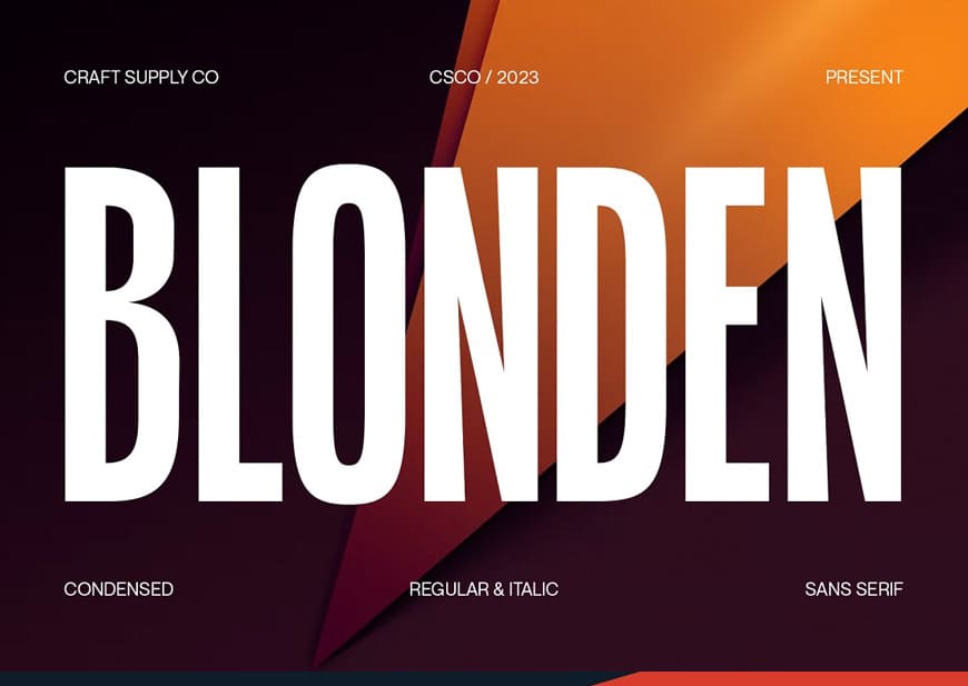
The condensed fonts are typefaces characterized by their narrow width and tight letter-spacing. Unlike their traditional counterparts, which often have a balanced and open structure, condensed fonts are designed to save horizontal space while maintaining legibility. The letterforms in condensed fonts are narrower and taller, resulting in a compressed appearance that can be especially beneficial in designs where space is at a premium.
In the world of graphic design, typography is more than just arranging letters on a page – it’s a powerful tool for conveying messages, evoking emotions, and enhancing visual appeal. Among the myriad choices available to designers, condensed font stands out as a versatile and impactful option. These sleek and space-saving typefaces offer unique advantages that can transform the way information is communicated and perceived in various design projects.
“The magic of condensed fonts lies in their ability to transform limited space into unlimited creativity.” – Anonymous
In this article, we’ll explore the world of condensed fonts and delve into why they are indispensable for graphic designers.
You may be interested in the following articles as well.
- Free Fonts: 20 Latest Free Fonts For Designers
- 15+ Best Vintage Fonts for Classic Designs
- 50 Remarkable Lettering and Typography Design Of 2023
- 50+ New Creative Websites Design with Amazing UIUX Trends
Condensed Fonts – Best Of 2023
Condensed fonts are memorable, fashionable, strong and elegant with skinny look. You can use different styles vintage, retro and create something very fresh and modern. There are 20+ best condensed fonts for graphic designers.
List of Condensed Fonts:
Advantages of Condensed Fonts for Graphic Designers
1. Space Optimization
One of the primary advantages of using condensed narrow fonts is their ability to optimize space without sacrificing readability. In projects with limited layout space – such as posters, banners, packaging, and magazine spreads – condensed fonts allow designers to fit more text or information within the same area. This is particularly valuable when designers need to balance text-heavy content with visual elements.
2. Visual Hierarchy and Emphasis
Condensed fonts are excellent for creating visual hierarchy within a design. They naturally draw attention due to their unique and compact appearance. Designers often use condensed fonts for headlines, subheadings, and important call-to-action elements, effectively guiding the viewer’s eye and directing their focus to key messages. The bold and impactful nature of condensed fonts makes them ideal for capturing the viewer’s attention and conveying a sense of importance.
3. Contemporary and Stylish Aesthetics
Condensed fonts exude a modern and stylish aesthetic that resonates well with contemporary design trends. Their streamlined and minimalist appearance can lend a touch of sophistication to a wide range of projects, from sleek websites to cutting-edge branding materials. The visual impact of condensed fonts can help convey a sense of innovation and forward-thinking, making them a popular choice among designers seeking to create a fresh and impactful visual identity.
4. Unique Branding and Identity
For businesses and brands aiming to stand out in a crowded marketplace, condensed fonts offer an opportunity to create a distinct and memorable visual identity. Choosing the right condensed font that aligns with a brand’s personality can result in a unique and recognizable look. By incorporating a well-chosen condensed font into logos, business cards, and other marketing materials, brands can establish a consistent and memorable presence.
5. Versatility in Design Projects
Condensed fonts are remarkably versatile and can be used across various design projects. From editorial layouts and web designs to packaging and signage, condensed fonts adapt to different contexts with ease. They can evoke different moods depending on the project – from professional and serious to bold and energetic – making them suitable for a wide range of industries and design styles.
6. Clever Visual Solutions
Designers often use condensed fonts to solve design challenges creatively. For instance, when dealing with limited vertical space in banners or social media posts, condensed fonts enable designers to maintain larger font sizes without sacrificing horizontal space. This results in better readability while still accommodating design constraints.
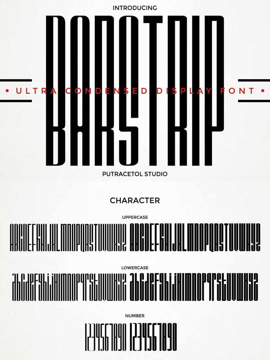
Barstrip Ultra Condensed Font
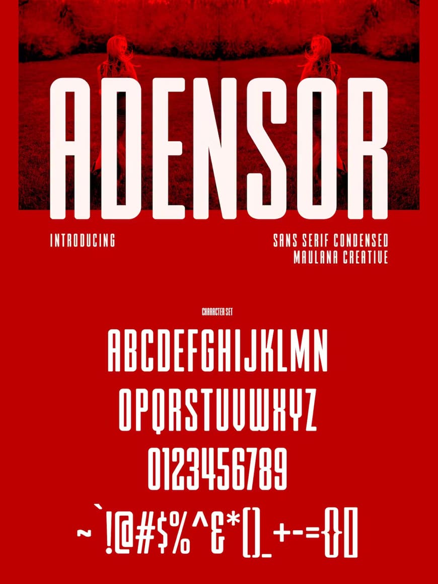
Adensor Condensed Display Font
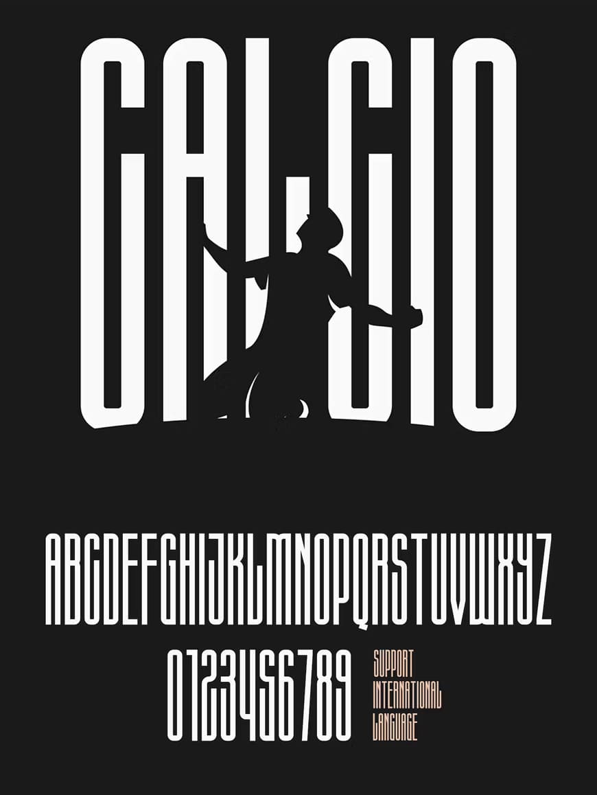
Calcio Ultra Condensed Font
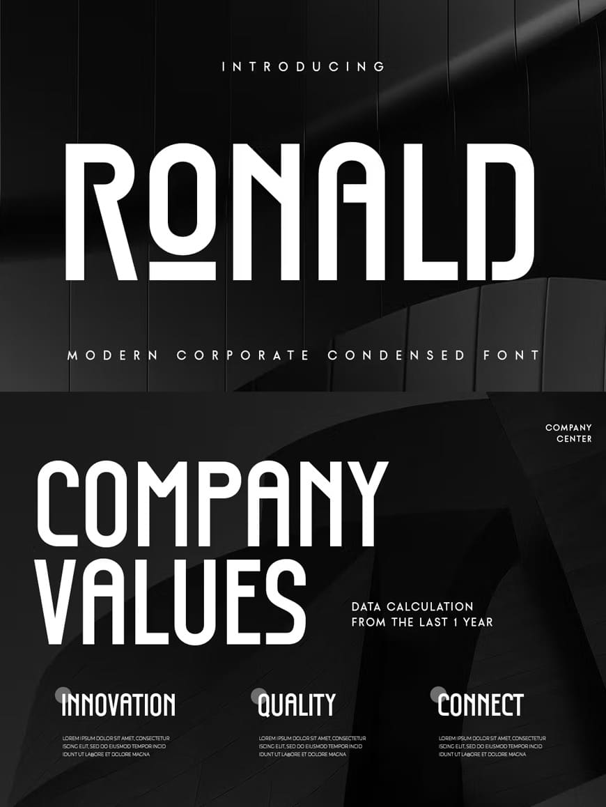
Ronald Modern Corporate Condensed Font
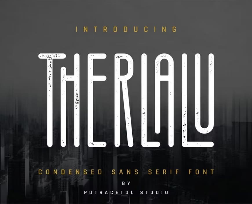
Therlalu Condensed Sans Serif Font
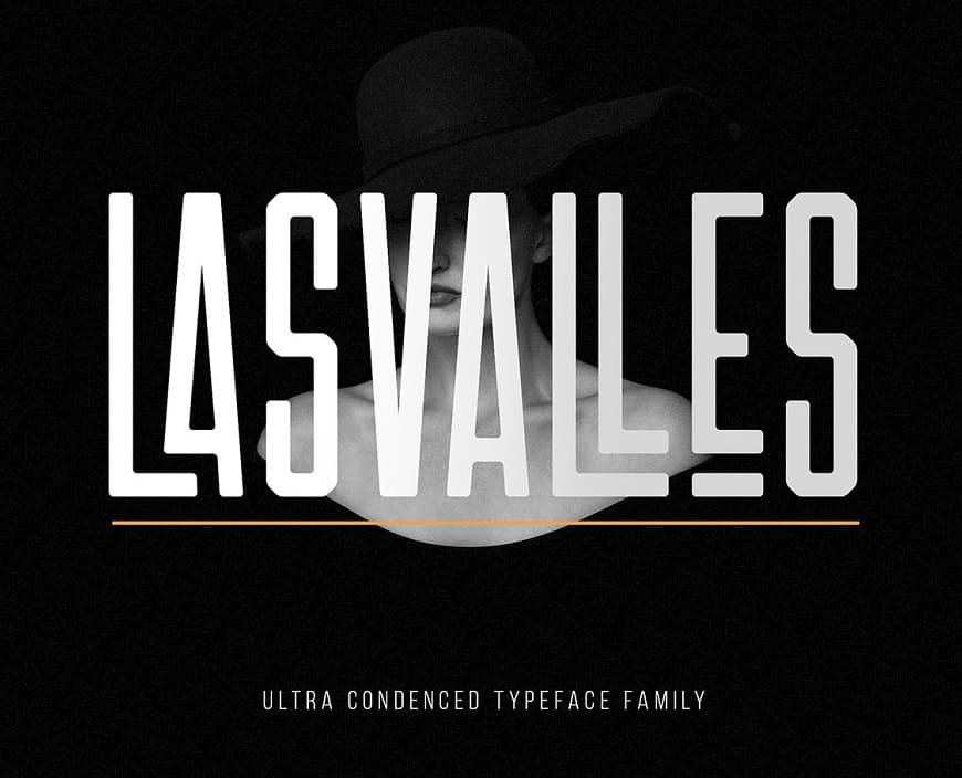
Las Valles Ultra Condensed Font
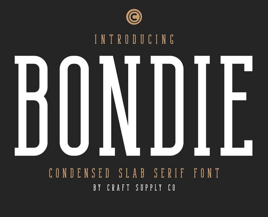
Bondie Condensed Slab Serif Font
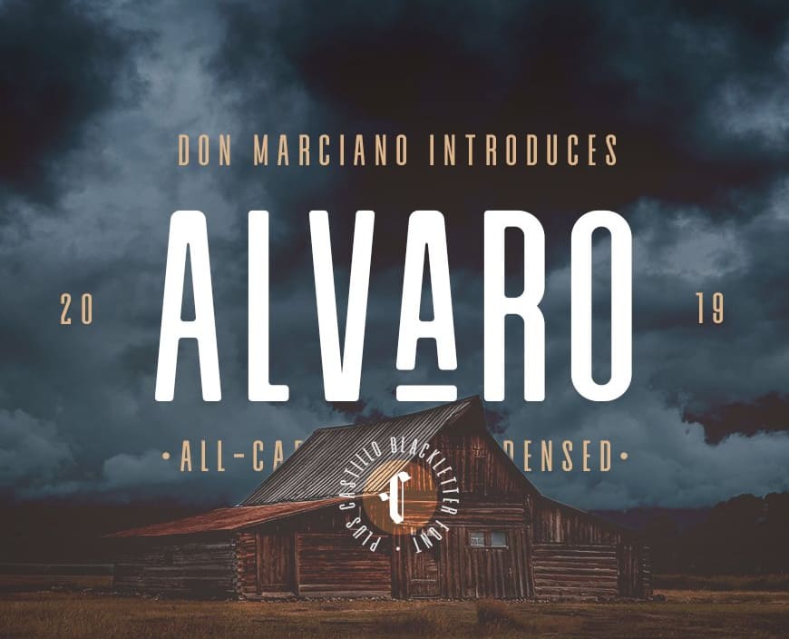
Alvaro Condensed Font
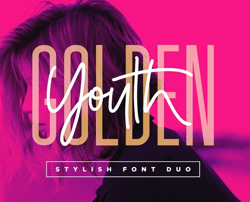
Golden Youth Condensed Font
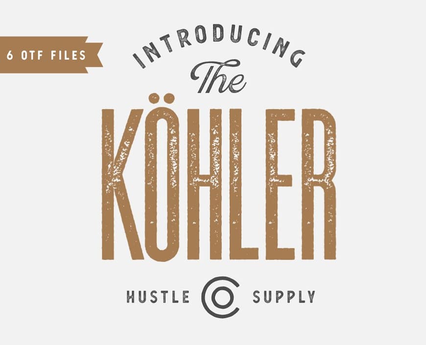
Kohler Ultra Condensed Font Family
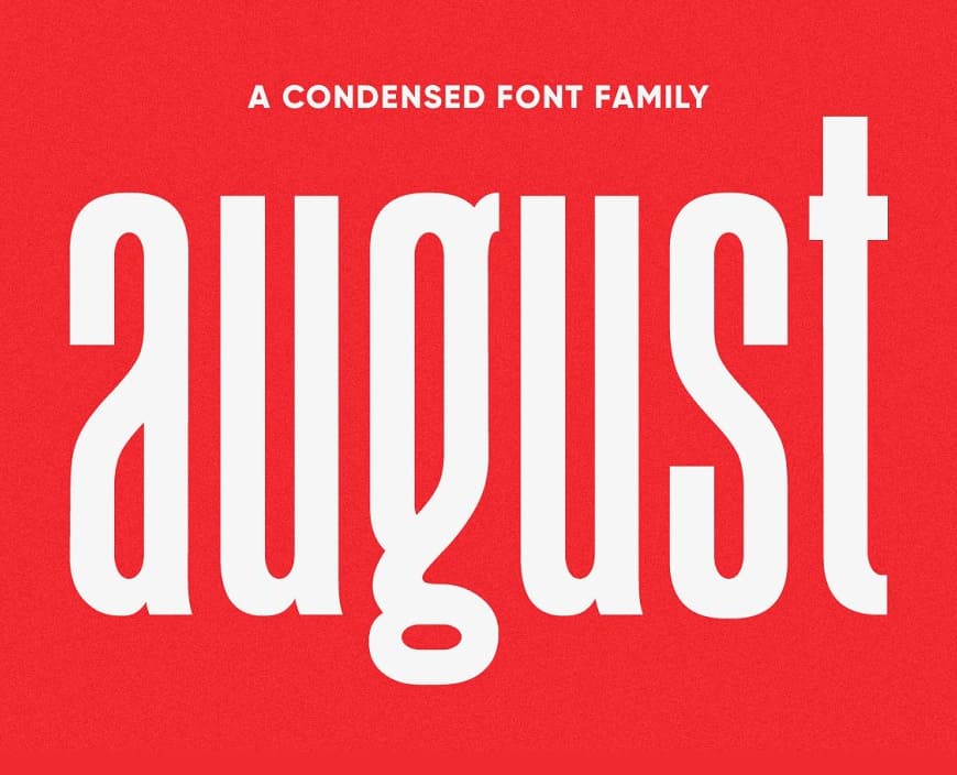
August Condensed Sans Serif Typeface
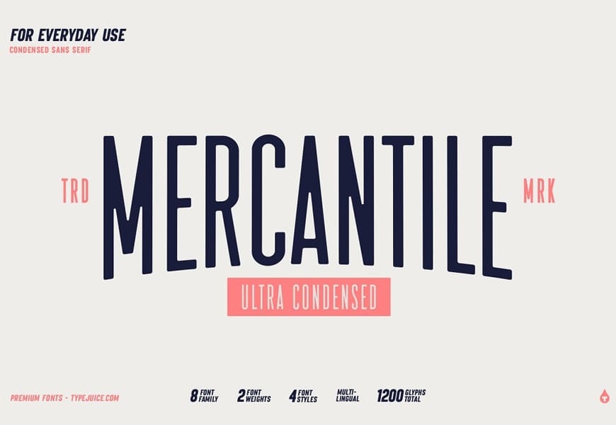
Mercantile Ultra Condensed
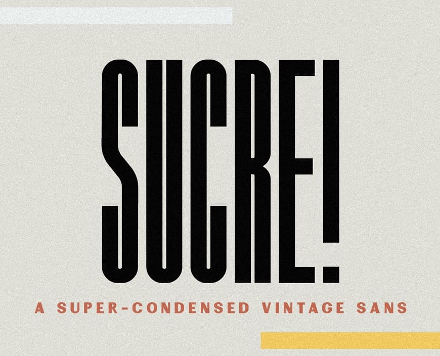
Sucre Vintage Condensed Sans Font
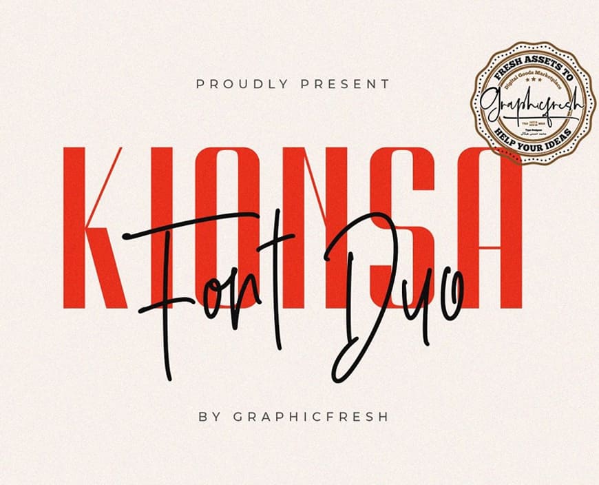
Kionsa Ultra Condensed Font Duo
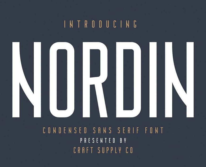
Nordin Condensed Sans Serif Font
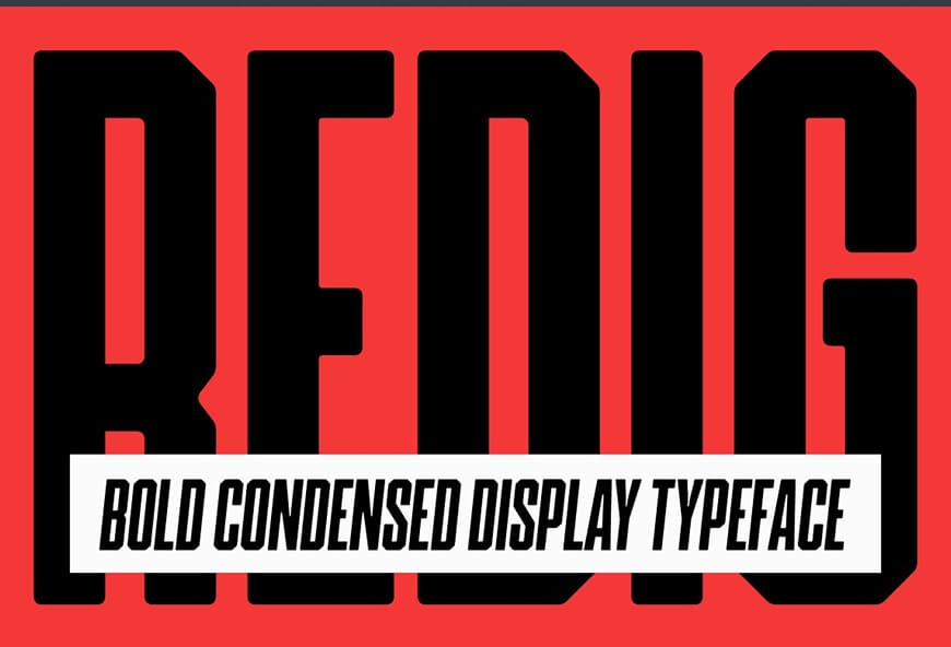
Redig Condensed Bold Sans Font
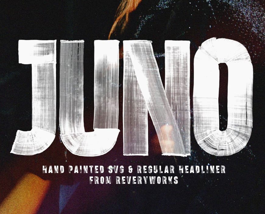
Juno Condensed Hand Painted Headliner Font
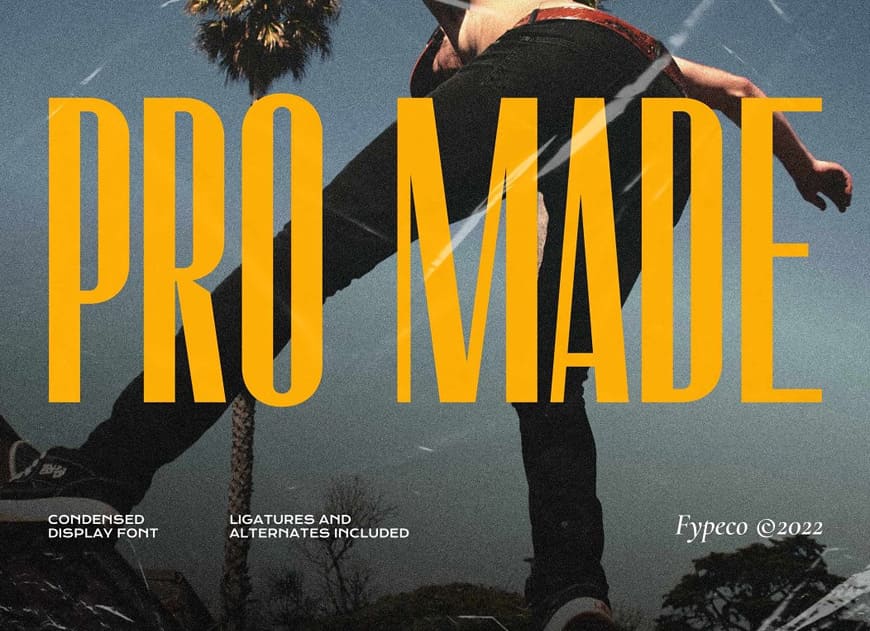
Pro Made Condensed Display Font
Vertikal Condensed Font
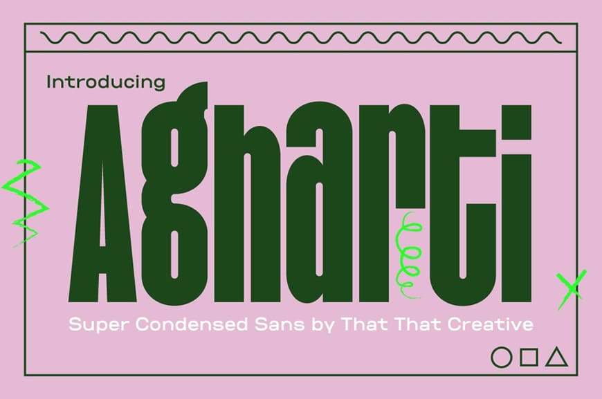
Agharti Bold Condensed Display Font
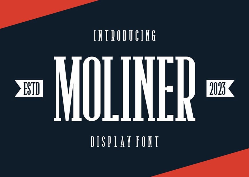
Moliner Condensed Display Font
Blonden Condensed Sans Serif Font
Choosing and Using Condensed Fonts Wisely
While condensed fonts offer a plethora of advantages, their selection and usage require careful consideration:
- Legibility: Prioritize legibility, especially when using condensed ultra narrow fonts for body text. Ensure that the chosen font doesn’t compromise readability, even in longer paragraphs.
- Contrast: Pair condensed typefaces with complementary typefaces to establish a balanced visual contrast. Combining a condensed font with a more open and spacious typeface can enhance both readability and aesthetics.
- Brand Consistency: If you’re using condensed or narrow fonts as part of a brand identity, ensure consistency across all materials. The selected font should resonate with the brand’s voice and values.
- Hierarchy: Capitalize on the visual impact of condensed fonts to establish hierarchy. Use them for prominent headlines and subheadings to guide the reader’s attention effectively.
- Testing: Always test the chosen condensed font in various contexts and layouts to ensure it works harmoniously with other design elements.
The best condensed fonts have become an essential tool in a graphic designer’s arsenal due to their space-saving attributes, visual impact, and contemporary aesthetics. From maximizing space in layouts to creating distinctive brand identities, condensed fonts offer a unique set of advantages that cater to the demands of modern design. By understanding their benefits and integrating them thoughtfully into design projects, graphic designers can harness the power of condensed fonts to create visually compelling and impactful designs that leave a lasting impression.
The post Condensed Fonts: A Graphic Designer’s Toolbox for Efficient and Impactful Designs first appeared on Graphic Design Junction.
Courtesy: https://graphicdesignjunction.com/2023/08/condensed-fonts/


