In the world of logistics and transportation, a well-designed logo is more than just an image; it’s a visual representation of your brand identity, values, and services. Your trucking company’s logo is often the first impression customers have of your business, making it a critical element in establishing a memorable and impactful brand identity. To help you navigate the process of creating a powerful trucking logo, here are detailed tips divided into key subheadings, complete with examples, logo design quotes, and relevant image references.
How to Create a Strong Brand Identity:
A strong brand identity is essential for standing out and building trust with your audience. Your trucking logo design plays a crucial role in shaping that identity.
Table Of Content
- Simplicity: The Art of Lasting Impression
- Reflecting Core Values: Visualizing Your Identity
- Color Psychology: Evoking Emotions
- Industry Symbols: Conveying Expertise
- Typography: Communicating Through Fonts
- Scalability: From Billboards to Business Cards
- Uniqueness: Standing Out in a Crowd
- Modern Trends: Balancing Tradition and Innovation
- Feedback and Iteration: Refining the Perfect Logo
- Testing Across Platforms: Ensuring Consistency
- Conclusion
In this article, we’ll explore key tips to help you create a compelling and memorable logo that speaks volumes about your trucking business.
1. Simplicity: The Art of Lasting Impression
Tip: Aim for a simple yet distinctive logo design. Complexity can lead to confusion, whereas simplicity ensures easy recognition and memorability.
In a world often characterized by complexity and noise, simplicity stands as a beacon of clarity and elegance. It’s the art of distilling the intricate into the understandable, the intricate into the understandable, and the overwhelming into the manageable.
Simplicity is the key to making a lasting impression, for it cuts through the clutter, resonates with clarity, and leaves a mark that endures. Whether in design, communication, or daily life, simplicity is a powerful tool that fosters understanding, evokes appreciation, and lingers in memory.
In its quiet elegance, simplicity leaves an indelible mark, reminding us that sometimes, less truly is more.
Example: FedEx Logo
“Simplicity speaks volumes. The FedEx logo’s iconic use of negative space in the letter ‘E’ to form an arrow symbolizes movement and progress—a subtle touch that leaves a lasting impression.”
2. Reflecting Core Values: Visualizing Your Identity
Tip: Your logo should embody your trucking company’s core values and mission. Consider how you want your business to be perceived and integrate those elements into the design.
Visual design is a potent canvas for projecting an entity’s core values and identity. It serves as a mirror, reflecting the essence and beliefs that define an organization or individual. By thoughtfully integrating key principles and ideals into design elements such as logos, color schemes, and imagery, one can create a visual identity that resonates authentically with their core values.
This alignment not only communicates a clear message but also fosters a deep and lasting connection with the intended audience. In essence, visualizing your brand identity through design becomes a powerful means of showcasing what you stand for, forging trust, and leaving a memorable imprint on the world.
Example: UPS Logo
“A logo should tell a story. The UPS shield symbolizes trust and reliability, reflecting the company’s commitment to secure and timely deliveries.”
3. Color Psychology: Evoking Emotions
Tip: Choose colors that resonate with your brand’s personality and services. Different colors evoke various emotions, which can influence how customers perceive your trucking business.
Color wields a remarkable influence on our emotions and perceptions. It is a universal language that can communicate feelings and moods without words. Color psychology delves into this phenomenon, exploring how specific colors can evoke distinct emotional responses. For example, warm colors like red and orange often stimulate excitement and energy, while cool colors like blue and green tend to convey calm and tranquility.
Understanding the psychological impact of colors is invaluable in various fields, from marketing and branding to interior design and art therapy. Harnessing the power of color allows us to create environments and visuals that evoke precisely the emotions we intend, making it a captivating realm of study and application.
Example: DHL Logo
“Colors speak louder than words. DHL’s vibrant yellow exudes energy and speed, instantly conveying their focus on efficient express shipping.”
4. Industry Symbols: Conveying Expertise
Tip: Incorporate symbols related to the trucking industry to communicate your specialization and expertise at first glance.
In the world of brand identity, industry symbols serve as potent tools for communicating expertise and authority. These visual icons condense the essence of a profession, field, or business into a single, recognizable emblem. Think of the stethoscope for healthcare or the wrench for plumbing. These symbols instantly convey competence and specialization. They transcend language barriers and create an immediate connection between the brand and its audience.
By incorporating industry-specific symbols into their branding, companies and professionals not only establish credibility but also make it easier for customers to identify and trust their expertise, making these symbols a cornerstone of effective brand identity.
Example: Trucking Co. Logo
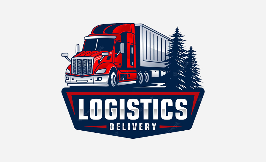
“A well-designed logo is a symbol of trust. The Trucking Co. logo includes a stylized truck, capturing the essence of their transportation services.”
5. Typography: Communicating Through Fonts
Tip: The right typography can enhance your logo’s message. Choose fonts that align with your brand’s tone, whether it’s bold and modern or classic and timeless.
Typography is a powerful medium for conveying messages, emotions, and personality through fonts. It goes beyond mere text; it’s a design language that influences how words are perceived. Fonts can evoke elegance with a serif, convey modernity with a sans-serif, or add playfulness with a script. The choice of typeface, size, and spacing all play a role in shaping the reader’s experience.
Typography can make content approachable, authoritative, or artistic. It bridges the gap between written and visual communication, allowing designers to craft compelling narratives. It’s a silent yet eloquent storyteller, a fundamental element in design, and an art form in its own right.
Example: Roadways Logistics Logo
“Typography sets the tone. The Roadways Logistics logo uses sharp, bold fonts to convey strength and efficiency in the logistics sector.”
6. Scalability: From Billboards to Business Cards
Tip: Design a logo that remains clear and recognizable regardless of its size. A scalable logo ensures your brand’s visibility across various mediums.
Scalability is the art of adapting brand identity design seamlessly across various platforms, from billboards to business cards. It’s the ability to maintain visual consistency and impact, whether the canvas is vast or compact. A scalable design ensures that the essence of a brand or message remains intact, regardless of the size or medium. It’s about harmonizing proportions, optimizing readability, and preserving the core aesthetic. Scalability is a critical aspect of effective design, enabling seamless transitions from the grandeur of outdoor advertising to the intimacy of a business card. It underscores the adaptability and enduring impact of well-crafted visual communication.
Example: Cargo Haulers Logo
“Flexibility is key. The Cargo Haulers logo’s clean design ensures legibility whether it’s on a massive truck or a small shipping label.”
7. Uniqueness: Standing Out in a Crowd
Tip: Strive for a logo that differentiates your trucking company from competitors. Originality and creativity capture attention and leave a memorable impression.
Uniqueness is the beacon that guides individuals and brands through the sea of similarity. It’s the essence of standing out in a crowd, a signature that distinguishes from the ordinary. In a world inundated with information and choices, being unique is a prized asset. It captivates attention, sparks curiosity, and fosters memorable connections. Uniqueness is the fusion of authenticity, creativity, and individuality, resulting in a singular identity that leaves an indelible mark.
Whether in personal expression or brand identity, embracing one’s distinctiveness is the key to being noticed, remembered, and cherished in a crowded landscape. It’s a celebration of what makes each of us extraordinary.
Example: Swift Transports Logo
“Unique designs make lasting memories. Swift Transports’ arrow logo stands out, conveying both speed and direction with a touch of creativity.”
8. Modern Trends: Balancing Tradition and Innovation
Tip: Blend timeless design principles with contemporary trends to ensure your logo remains relevant and visually appealing to modern audiences.
Modern trends strike a delicate balance between honoring tradition and embracing innovation. They draw inspiration from the past while boldly venturing into the future. In today’s dynamic world, successful trends harmonize the timeless with the contemporary, bridging generational gaps. They infuse fresh perspectives into established practices, revitalizing culture and industries. Modern trends acknowledge heritage as a source of wisdom and brand identity while pushing boundaries with groundbreaking technologies and ideas.
This synergy creates a dynamic cultural landscape, where innovation thrives while paying homage to the roots that ground us. In essence, modern trends embody the evolution of tradition, ensuring a vibrant and progressive world.
Example: Modern Logistics Logo
“Elegance in simplicity. The Modern Logistics logo employs negative space to convey a sense of sophistication while staying in tune with current design trends.”
9. Feedback and Iteration: Refining the Perfect Logo
Tip: Involve stakeholders and designers in the feedback process to refine your logo design iteratively. Collaboration often leads to a logo that perfectly encapsulates your brand.
Feedback and iteration are the dynamic duo behind crafting the perfect logo. They form a cyclical process that transforms ideas into iconic symbols. Feedback, often from clients and peers, sheds light on what’s working and what needs improvement. It’s the compass guiding the way.
Iteration is the journey of refining and enhancing the design based on feedback, a series of adjustments that inch closer to perfection. This collaborative dance fine-tunes colors, shapes, and concepts until the logo embodies the brand’s essence. It’s a testament to the power of constructive critique and the dedication to continuous improvement, resulting in logos that stand the test of time.
Example: Freeway Express Logo

“Collaboration breeds success. The Freeway Express logo evolved through continuous feedback, representing the company’s commitment to seamless transportation.”
10. Testing Across Platforms: Ensuring Consistency
Tip: Test your logo across various platforms and applications to ensure it remains effective and recognizable, regardless of where it’s displayed.
Testing across platforms is vital to ensure consistency in user experiences. It verifies that websites and apps perform seamlessly on various devices and browsers, maintaining a uniform look and functionality. This process guarantees that users enjoy a reliable and cohesive interaction, regardless of their chosen platform, ultimately enhancing satisfaction and trust.
Example: Nationwide Carriers Logo
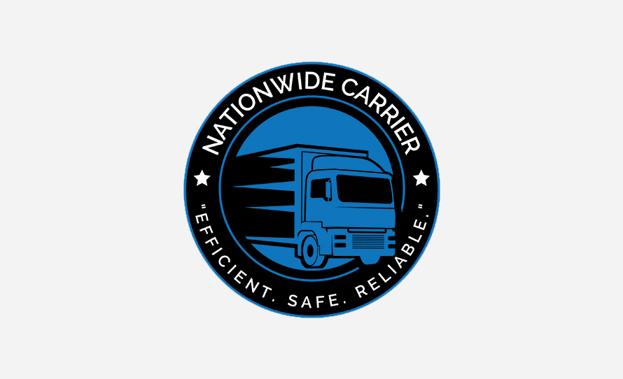
“Consistency matters. The Nationwide Carriers logo was rigorously tested to ensure it maintained its impact across truck doors, uniforms, and digital platforms.”
Conclusion
Crafting a strong brand identity through your trucking logo design involves a blend of thoughtful choices, creative design, and a deep understanding of your company’s values and services. By keeping your logo design simple yet distinct, reflecting core values, choosing appropriate colors, and ensuring scalability, you can create a logo that resonates with your audience and leaves a lasting impression. Remember, your logo isn’t just a graphic; it’s a visual representation of your trucking business’s personality and promises.
The post Tips to Create a Strong Brand Identity with Your Trucking Logo Design first appeared on Graphic Design Junction.
Courtesy: https://graphicdesignjunction.com/2023/09/create-strong-brand-identity/


