People get bored and tired of UI design trends, and each year, the pendulum swings the different ways. We all have experienced the fall and rise of iconic fashion pieces of art movements. In User Interface (UI) design, the same thing takes place. Interface styles range from those that look like real-world objects to those that are incredibly plain and simple. Each of them has advantages and drawbacks. Your ability to innovate, advance the design sector, and improve your design practice depends on your ability to generate and experiment with new UI design trends.
UI(User Interface) design is the process of designing the look, feel, and interactivity of a digital product. It is essential to remember that UI design and UX are not the same, although both of them go hand in hand.
UI is the point of interaction between computers and humans. It is the process of designing what these interfaces look and act like. For example, you are using an app on your mobile to book flight tickets. The buttons you touch, the screens you navigate and the forms you fill; in are all part of the user interface.
On the other hand, UX stands for user experience. The app’s user experience is determined by how people interact with it. Whether the experience is intuitive, smooth, clunky and confusing, or interacting with the app offers us the sense that they’re efficiently accomplishing the tasks they set out to achieve, or it feels like a struggle. User Experience is regulated by how easy or difficult it is to interact with the user interface elements that UI designers develop.
UI is necessary to meet the user’s expectations and support your site’s effective functioning. A well-developed user interface facilitates effective interaction between the users and the program, machine or app through visuals, clean and beautiful design and responsiveness.
10 UI Design Trends for Web Design
As the world advances, market online UX and UI design becomes more essential than before, and with this comes a lot of changes in UI trends. As new technologies arise, UI has the potential to become much more innovative in 2022 than in the past few years.
UI Design trends shape everything from how designers develop to user interface design for future interactions of everything from websites to package design. They can also zoom in or fade away quickly, making it critical to pay attention to what is trending nowadays so that you don’t end up with a design that falls out of style easily.
2020 and 2021 was interesting year in UI design. This past year foreshadows great changes in how we will use technology in the future. Here we have the collection of ten of the latest UI trends, some ongoing and some far reaching. Many related articles have also mentioned that these have been trending for the past two/three years now. On digital platforms, storytelling, unique illustrations, dark mode, ethical design and bold typography are always the defining elements.
#1 Illustrations
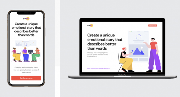
UI design trends help differentiate and make the product shine out among many. As we all know, in a sea of endless digital platforms, standing out is challenging. Illustrations can be hand-drawn or digital, 2D or 3D and have different aesthetics.
Additionally, static pages can benefit from illustrations, particularly when integrated with motion design. People are drawn to others, so including characters in a digital platform or product can improve user engagement, foster empathy, and create a memorable experience.
We should develop or create illustrations with proper planning to improve user experience instead of distracting users or just slowing down the platform. When done correctly, purposefully illustrations can improve conversion rates and increase user experience. Custom illustrations have taken over from stock images and have the power to uniquely visual appeal to your UI design trends and also help you tell the story of your brands and products.
These graphics frequently come to life with sophisticated motion UI design trends to stand out on these pages. This dynamic makes it simpler to grab people’s attention and easily express what the business or brand offers. A memorable illustration can add personality to websites or mobile apps, making them more remembered.
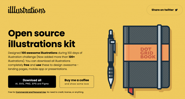
Also, if you’re looking for these amazing quality and eye-catching UI design trends illustrations for free, there are various sites you can find the one you desire. unDraw, illustAC, illustrations. Co and error404.fun are some of the sites that offer the best quality illustrations that can be used for your web design, so hurry and look. illustAC is a site which offers cost-free high-quality illustrations, vectors and clipart for the audience. You can easily download these excellent quality illustrations with one click on the image where the download button is. For the ease of the audience, illustAC offered a filter option and image option from which you can find the exact desired shape, size or color illustrations within minutes.
Whereas unDraw offers open-source illustrations for the audience, which can be used for any project or personal use you can imagine and create. Also, to download the illustrations of unDraw, you don’t need attribution. Likewise, error404 illustrations are free to customize and animate. You can use the different tools of error4040 to get the best-adapted result to enhance and make your project eye-catching.
Moreover, the feedback for such dynamism should always be remembered. After an event, feedback is necessary to ensure the assured action takes place. Moving elements and unique animations make users curious, and users can’t help scrolling to see what happens next.
#2 Motions and Animations
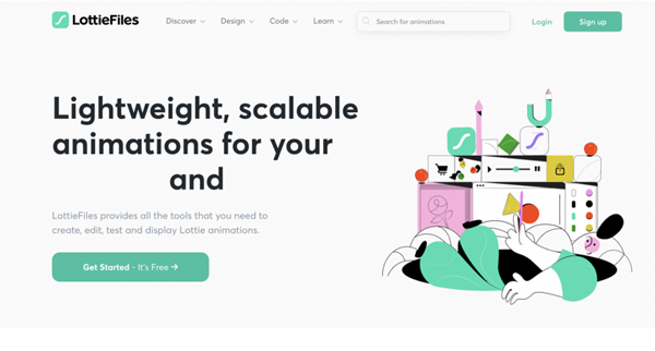
Motion UI design trends add appealing and customized animations and transitions to an interface. Both animation and motions in the UI design trends are a fun way to enrich a user experience and add life elements to an interface. This UI design trends increases visual appeal by adding the dimension of movement to a design.
If you are willing to make moving elements make sense and feel natural, you need to add animations; UI design trends that boost the design rather than distract from it. It is easy to get attracted by all these fun animations we see, but it is necessary to make wise decisions to ensure a successful design. Moreover, you can use animations to guide people or even entice your viewer or user to do a particular action or give feedback.
Additionally, you may use motion to communicate a story and provide motion to an interface to improve its aesthetic appeal. Through scroll-triggered animation, digital platforms may often contribute to storytelling. In this instance, movement happens after page scrolling is done. Because they choose how the story develops, users feel an active role in the storytelling, which to some extent enhances the immersive experience.
Therefore, adding animation or motion; to UI design trends can be a great way to give life to static interfaces, which, if done rightly, will enhance user experience and user involvement in your brands.
#3 Bolder and more characteristic fonts
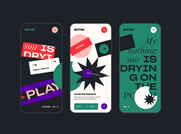
Typography is given center stage in the UI trend known as ancient typography or rule-breaking typography. Typography transcends its conventional function in this design aesthetic and takes on a central position. Rules are different when typography is the primary component of a design; spinning, twisting, extravagant sizes, dividing words into multiple lines, and poor readability are all acceptable. To properly bend the rules of typography, it is necessary to understand them. It is advisable to make such remarkable design decisions only when necessary. Bolder typography; UI design trends make a big statement and have a more excellent value, requiring thought through and planned very thoughtfully.
Since most fonts are customized to the aesthetics of particular sectors, font UI design trends aren’t all that interesting to discuss. Serif fonts are frequently found in fashion and note-taking apps, while sans serif fonts are more common in digital products. Brands beginning to embrace and adopt the aesthetic of considerably bolder fonts and ink traps fonts in their UI design are two UI design trends that will impact in 2022.
Let’s take an example of Nike and Discord when they had a branding refresh in 2021, which looked like they were similar. A similar thing was chunky typography on their pages. However, the chunky fonts look perfectly bounce off the negative space with a stronger emphasis on titles.
For those who may not know about the phrase, an ink trap is a characteristic of some fonts created for tiny-size printing. The letterforms have no corners or other details. Ink spontaneously spreads into the missing area as the type is printed. Extra ink would bleed outside without ink traps, ruining the sharp edge.
Though ink traps were initially developed for printing on newsprint for small sizes, we have been watching the just opposite of that recently. A bold oversized version of these fonts began appearing on websites, adding more characteristics to the fonts.
#4 Dynamic Color Palettes
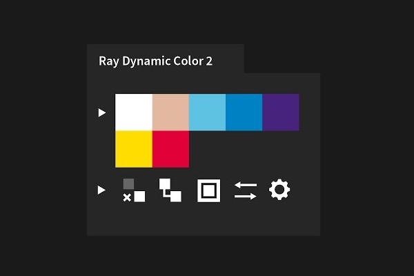
With it, Google opened up Android 12, the new UI: Material You. Aside from significant redesign, Android features that stand out the most for all of us were the dynamic color palettes. This means more customization for how your smartphone looks. Setting it up is not challenging; baked on your wallpaper, it advises you on a color palette( UI design trends) that can match in color, tone, and shades and develop an appealing and harmonious result.
This update was opened last year, but as we all know, Android updates have a slower adoption rate than iOS, and manufacturers also develop their own version of the OS. Take an example of Samsung’s One UI 4, which is on top of many updates and has dynamic color palettes. Having that on Android doesn’t mean that iOS users will have a feature like that in the future. Moreover, Apple is really particular about what new changes they introduce to iOS.
When it comes to UI design trends, designers should keep dynamic color palettes always in mind. Such palettes stand a good possibility of becoming common on Android starting in 2022 as more companies adopt this trend.
#5 Dark Mode
The night mode In the UI design trends aesthetic, the light text is placed on a dark background. According to several studies, this color scheme helps to improve visual hygiene by lowering eye strain and the luminance generated by device screens. Potentially reducing eye fatigue is especially beneficial for user interfaces that require extensive reading by the user. Dark mode and UI design trends also contribute to battery power savings.
This dark mode UI design trends were born or came to market as a countermove to the dark on light color schemes, which triggered the presence of ink on white paper. When Twitter experimented with a light-on-dark color, this dark mode UI design trends appeared in 2016. However, many older operating systems worked with the light fonts on dark backgrounds from the Matrix films.
However, this UI design trend became more renowned when Apple released a dark mode option in the iOS 13 update. Since then, dark modes UI design trends have become a common alternative in many interfaces, where users can make a selection between a light and a dark interface.
Dark mode UI design trends have a sleek, modern visual appeal and sharpness that might be gentler on the eye. Hence, dark theme UI design trends became famous in response to increased users’ time spent on screen. If you are designing a product where your possible users or buyers will be involved on screen for a long time, you are more likely to consider the dark theme option.
#6 UI design for AR/VR
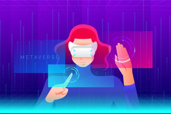
Since Facebook rebranded itself as Meta, there have been a lot of noises about what the future could be in terms of communication and living our lives in the metaverse. Metaverse is a combination of multiple technology segments that include virtual reality, augmented reality, and video, where users live within a digital universe. Its supporters say it is the next internet and has immense potential. If Meta’s strategy goes well, it is possible to watch the AR/VR markets skyrocket in the near future.
Meta has planned to force prices down on the Oculus headsets like the Quest. A bigger market emphasises developing new experiences on these platforms, possibly opening new doors for UX/UI design. These UI design trends will involve thinking outside the box instead of sticking to the grid and forgetting the UI that is restricted to screens. Instead, you should emphasize interactions that feel like they take place within the natural world environment.
In addition to augmented reality, Apple and Google have already introduced their AR development platforms, i.e., ARKit and ARCore, which goes well with both the digital and physical worlds. There is numerous access to AI UI design trends, and they are:
- Real-world items with connected interactions related to one another are fixed to the screen area.
- The user must place the camera in a specific position referring to the real world and use the physical environment.
Hence being a designer, you should always expand your knowledge with the trending AR UI design kits. Moreover, you can also think through the context and function of AR experiences carefully. As a designer, you should always know that you must prepare and begin learning and understanding new tools( UI design trends). The skill and capacity to develop or create augmented reality interfaces and 3D elements can be helpful in the coming years.
#7 Design for Foldable
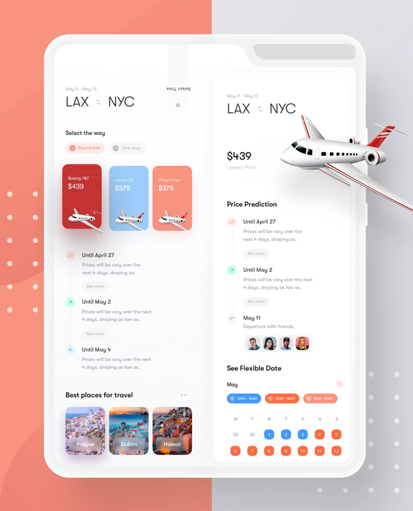
Samsung is an excellent example of an amazing foldable smartphone. The Z flip and the Z flip three of Samsung sold numerous more units than its predecessors. As this technology is getting far better and better and cheaper, you can see other manufacturers trying to succeed in this market; hence the software has to be adopted soon.
With the release of the new Android 12, Google made a subpage on materials.io detailing all the conditions and constraints to consider adapting apps for foldable screens. These are the foremost steps when considering foldable screens(UI design trends) in a product design workflow. This market is not still here, but with the rumors and dedications from Google and to lay the rules of rising demand, you can see these UI design trends this year or in the coming year.
Designers must swiftly become adapted to building more adaptable screens for foldable gadgets, which could open up new opportunities for innovation and creativity.
#8 Almost Brutalism
People want to embrace the brutalist website UI design style, but most projects can’t use it because it’s too rough and pointed. Here we have virtually brutalism, the most recent expression of this style.
These brutalism UI design trends utilize many of the same stark effects but with a lighter edge. Rather than the small typography, sand serifs and more accessible visuals are the keys. In Addition, instead of using sharp edges, there’s sample space between the elements even though there are distinct lines and boundaries. There are numerous frills or other visuals that ultimately leave fonts and colors to carry the projects.
#9 Inclusive Design
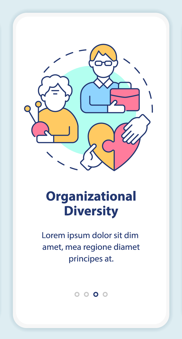
Today, designers are working towards a more inclusive web and following the UI design trends seen in almost everything published nowadays. There are no more reasons for designers to make their projects more inclusive following the UI design trends from imagery to language to alt text. Inclusivity enlarges gender neutrality, culture, race, ability, and accessibility.
The most common theme is that your website design should be created so that if anyone is interested in accessing the content, viewers or visitors can see other individuals who relate to it on the screen.
But it would help you a lot if you are careful not to go over the top with the images and typography that screams, We are inclusive. This is one of those UI design trends that is more about showing than telling, and being true self and authentic is more essential than forcing it.
#10 Extraordinary Imagery
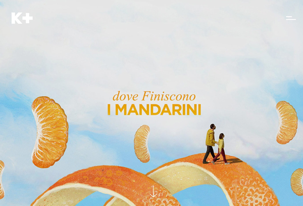
What do you think about where the line reality ends and the imaginary starts? When you watch a lot of websites, you might not be sure 100%, and that’s fine. So, try to make your design fun by following the UI design trends and merging the real and imaginary to develop pretty extraordinary imagery. Remember, there are no limitations to the imagination.
For example: In K Plus Film, the people are located on top of fruits flying around the screen. The color and scale in this K plus Film create an engaging visual that’s anything but typical.
Conclusion
The coming year is already looking to explode extraordinarily regarding website and UI design trends. Understand and learn about how you can combine these elements into existing projects or as a part of something new. And, be creative and have fun.
Also, if you are looking for customized and stock illustrations and vector images for your websites to follow the UI design trends, then illustAC is where you can surely find one. There are various other sites like illustrations. Co, unDraw, which also provides high-quality illustrations, so have a look at them; you might find the one imagery that matches your requirements.
 The post 2023 UI Design Trends: 10 Best Practices For Web Design first appeared on Graphic Design Junction.
Courtesy: https://graphicdesignjunction.com/2022/08/2023-ui-design-trends/


